Testing your web application on mobile devices is crucial for ensuring a seamless user experience. As smartphones, especially iPhones, dominate web traffic, it’s essential to see how your site performs on these devices.
Accessing your localhost on an iPhone can be tricky. This guide will walk you through the necessary steps to achieve this. You’ll learn how to get the iPhone width on a localhost browser, ensuring your development environment closely mimics real-world usage.
The purpose of this guide is to provide you with:
- An understanding of how localhost works in web development
- Practical steps to access localhost on your iPhone
- Tips for configuring viewport settings and debugging layout issues
By following these instructions, you’ll be well-equipped to optimize your web applications for mobile users.
Understanding Localhost and Its Behavior
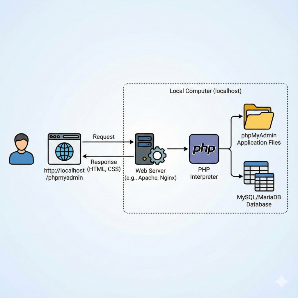
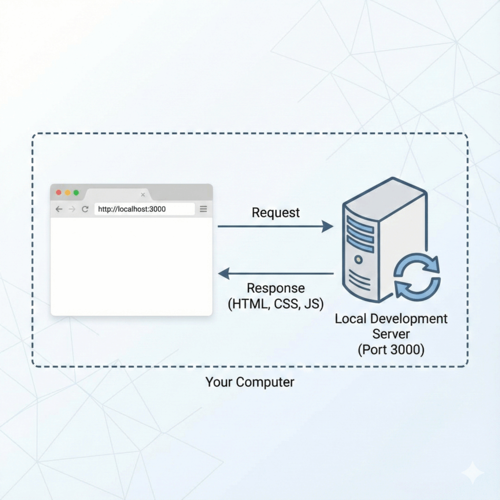
Localhost Setup is a fundamental aspect of web development. It refers to the practice of running a web server on your own computer during the development phase. This setup allows you to test and debug your applications in a controlled environment before deploying them live.
How Localhost Differs from Live Environments
- Isolation: Localhost operates in isolation, meaning it’s only accessible on your local network unless exposed via tunneling services like Ngrok.
- Performance: Typically faster as it doesn’t involve internet latency.
- Security: Generally more secure since it’s not exposed to the internet by default.
Common Issues Developers Face with Localhost
- Network Connectivity: Both devices need to be on the same network if you’re testing across multiple devices.
- File Path Errors: Incorrect file paths can lead to missing resources, causing layout issues.
- Environment Discrepancies: Differences in software versions between your local machine and the live server can result in unexpected behavior.
Understanding these aspects ensures that you can effectively navigate and troubleshoot common problems, making your localhost setup a robust testing ground for your web applications.
Accessing Localhost on Your iPhone
To view your app on a mobile device, it’s crucial that both your computer and iPhone are connected to the same Wi-Fi network. This shared network connection allows your devices to communicate effectively.
Steps to Access Localhost:
- Find Your Local IP Address: On your computer, open the terminal or command prompt and type
ipconfig(Windows) orifconfig(Mac/Linux). Look for the local IP address, usually something like192.168.x.x. - Use the Local IP on iPhone: Open Safari or any browser on your iPhone and enter the URL in this format:
http://<your-computer-ip>:<port-number>. For example,http://192.168.1.5:3000.
This method ensures that you can test your application in a mobile environment without deploying it live. Reliable network connectivity is essential here; intermittent connections can disrupt testing and lead to inconsistent results.
Note: Ensure firewall settings on both devices allow incoming connections for seamless access.
Using Ngrok for Remote Access to Your Application on iPhone
What Ngrok Is and Its Benefits for Developers
Ngrok is a powerful tool that allows developers to expose their localhost server to the internet securely. This is particularly useful for testing mobile behavior without deploying the application to a live server. By creating a secure tunnel, Ngrok provides a public URL that can be accessed from anywhere, including your iPhone.
Benefits of Ngrok:
- Ease of Use: Quick setup with minimal configuration.
- Security: Secure tunnels protected by HTTPS.
- Access Anywhere: Enables remote access from any device.
- Real-Time Insights: Provides detailed traffic inspection and usage analytics.
Step-by-Step Instructions to Set Up Ngrok for Exposing Localhost
- Download and Install Ngrok:
- Visit Ngrok’s official website and sign up for a free account.
- Download the appropriate version of Ngrok for your operating system.
- Extract the downloaded file and move it to a directory included in your system’s PATH.
- Authenticate Your Ngrok Installation:
- Log in to your Ngrok account on their website.
- Copy your unique authentication token from the dashboard.
- Open your terminal and run the following command: shell ngrok authtoken
- Expose Your Localhost Server:
- Start your local development server if it’s not already running.
- In the terminal, navigate to your project directory and execute: shell ngrok http
- For example, if your server is running on port 3000, you would run: shell ngrok http 3000
- Get the Public URL:
- Ngrok will provide you with a public URL that looks something like
http://<random-string>.ngrok.io. - Example output: plaintext Forwarding http://abcd1234.ngrok.io -> http://localhost:3000 Forwarding https://abcd1234.ngrok.io -> http://localhost:3000
How to Use the Generated Public URL on Your iPhone for Testing
- Ensure both your computer and iPhone are connected to the internet.
- Open Safari (or any browser) on your iPhone.
- Enter the provided public URL from Ngrok (
http://<random-string>.ngrok.io) into the address bar. - The page should load, reflecting how it appears on an actual mobile device.
Using Ngrok ensures you can view and test your web applications as they would appear on an actual iPhone, providing real-world feedback without needing a live deployment. This method of accessing localhost through a public URL helps in identifying potential issues early in the development process.
Configuring Viewport Settings for Mobile Devices in Localhost Browser Testing
Proper viewport configuration is crucial for delivering a seamless mobile viewing experience. When you test your web application on a localhost browser, ensuring an accurate viewport setup can mimic the actual appearance and behavior on an iPhone.
Importance of Viewport Configuration
- Responsive Design: Ensures that your web application adjusts smoothly across different screen sizes and orientations.
- User Experience: Enhances navigation and readability, making content accessible without excessive zooming or scrolling.
- Consistency: Provides a consistent look and feel between your localhost environment and live deployment.
Implementing the Viewport Meta Tag
To configure the viewport settings, you need to include a meta tag in your HTML file. This meta tag instructs the browser on how to control the page’s dimensions and scaling.
html
Impact on Layout
Including this simple line of code has a significant impact:
- Scaling: Sets the width of the page to follow the device’s width (i.e., iPhone width), ensuring that the content scales appropriately.
- Initial Zoom Level: Defines the initial zoom level when the page is first loaded. Setting
initial-scale=1.0means no zooming in or out when the page loads. - Dynamic Adjustments: Adapts dynamically to changes in device orientation from portrait to landscape and vice versa.
By incorporating this viewport meta tag, you ensure that your web application renders correctly during local browser testing, closely resembling its appearance on an actual iPhone. This approach minimizes layout discrepancies and enhances overall usability on mobile devices.
Debugging Layout Issues in Localhost Browser Testing Using Safari Developer Tools on iPhone
Debugging layout issues on your localhost can be challenging without the right tools. Safari Developer Tools offer a powerful solution to inspect and debug your website directly on an iPhone. Here’s how you can leverage these tools:
Step-by-Step Guide to Enable Web Inspector Settings on Your iPhone
- Open Settings: Navigate to the Settings app on your iPhone.
- Go to Safari Settings: Scroll down and tap on Safari.
- Access Advanced Settings: Within Safari settings, scroll to the bottom and select Advanced.
- Enable Web Inspector: Toggle the switch next to Web Inspector to enable it.
Connecting Your iPhone to a Mac for Inspection
- Connect via Lightning Cable: Use a lightning cable to connect your iPhone to your Mac.
- Open Safari on Mac: Launch Safari on your Mac.
- Develop Menu Activation: If the Develop menu is not visible, enable it by going to Safari > Preferences > Advanced and checking the box for Show Develop menu in menu bar.
- Select Your Device: In the Develop menu, you should see your connected iPhone listed under ‘Devices’.
- Inspect Elements: Click on your device name, then select the page you want to inspect. This will open a web inspector window where you can inspect and debug elements just like you would with a desktop site.
Using these steps, you can efficiently troubleshoot layout issues by inspecting HTML, CSS, and JavaScript directly on your iPhone from your Mac. This method ensures that what you’re seeing is an accurate representation of how users will experience your site on their mobile devices.
For developers working with localhost environments, this process is essential for ensuring that web applications are responsive and visually accurate across devices.
Troubleshooting Common Issues in Localhost Browser Testing with iPhone Widths
When testing your web application on localhost, you may encounter layout differences between localhost and actual devices. Identifying and resolving these discrepancies is crucial for a consistent user experience.
Common Reasons for Layout Differences
- Viewport Configuration: Incorrect or missing viewport meta tags can result in improper scaling and responsiveness on mobile devices. Ensure your HTML includes the correct
<meta name="viewport" content="width=device-width, initial-scale=1">tag. - CSS Media Queries: Media queries designed for specific device widths might behave differently on localhost due to variations in screen sizes and resolutions. Verify that your media queries are set up correctly to accommodate iPhone dimensions.
- Cached Files: Browsers sometimes cache CSS and JavaScript files, leading to outdated styles being applied. Clear your browser’s cache regularly during development to prevent this issue.
Incorrect File Paths and Rendering Issues
Incorrect file paths can significantly affect how your site is rendered:
- Absolute vs Relative Paths: Using absolute paths (
/css/styles.css) instead of relative paths (./css/styles.css) might cause issues when moving from localhost to a live environment. Stick to relative paths for consistency. - Case Sensitivity: File systems on different operating systems handle case sensitivity differently. Ensure your file names match exactly, considering case sensitivity.
Solutions to Common CSS Access Problems
- Check Console Errors: Use the browser’s developer tools to check for any missing file errors or incorrect paths in the console.
- File Accessibility: Ensure all CSS files are accessible from the directory where your HTML files reside.
- Network Tab Inspection: Utilize the Network tab in developer tools to inspect if all resources are being loaded correctly without 404 errors.
By addressing these common issues, you enhance the accuracy of your mobile testing process on localhost, ensuring a seamless transition to live environments.
Conclusion
Testing your web applications on mobile devices is crucial for ensuring a seamless user experience. To effectively optimize for mobile, remember these key points:
- Accurate Viewport Configuration: Use the correct viewport meta tag to ensure your site scales properly on iPhones.
- Network Connectivity: Ensure both your computer and iPhone are on the same Wi-Fi network for accessing localhost.
- Tunneling Services: Leverage tools like Ngrok to expose your localhost server and test your application remotely.
- Debugging Tools: Utilize Safari’s Web Inspector for real-time debugging and layout adjustments.
By implementing these tips, you can confidently achieve the desired iPhone width on localhost browser testing.


